If you have a promotion or special event running,
let your people know! An announcement bar is a
great, non-intrusive place to do that. Make sure you
only have one special announcement at a time, and
resist the urge to bombard them with offers.
Keep your navigation clear and use common-speak.
Everyone comes to your site with a question, and
you want to make the answers easy to find. If you
can add a button, use it to tell your visitors the most
important thing to look at.
Choose a font + size for your headlines and text,
and keep it consistent throughout.
Keep your buttons visually consistent (same size &
font) and only use two colours - one for dark
backgrounds and one for light.
Use a compelling photo up top to greet your visitors.
Top choices: You, your space or something beautiful
that relates to your brand or transformation you're
guiding your clients toward.
When I say edit I mean EDIT. Keep this (and all of
the copy on your website) as sparse as possible. Too
many words scare many people off. If needed, you
can always add a button and link to another page for
those interested, but don't force a scroller to read a
novel, especially right off the bat.
Do people will feel different after they work with
you? Tell them all about it here. Start with what's
likely bugging them, and explain how your
solution will make them feel if you work together.
Visually break up sections, and try to keep the
entire section viewable on a screen if you can.
Using the rule of three is always a good idea.
Visually it's not overwhelming, but gives the space to
compare one product or service to another. We want
to give the reader options without overwhelming
them. You can also use a section like this to explain
what it looks like to work with you.
If you need to, add a button to link to a
services/shop/etc. page where you can list
everything.
You can also use screenshots of comments,
messages and emails with permission from the
person who wrote it. Edit them in Canva so they're
sized consistently before you use them.
If you need to expand on your service, you can link
to a page with a longer explanation from these buttons.
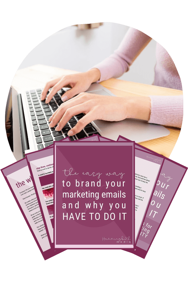
PRO TIP: Items you'd like to be listed (podcast
episodes, portfolio pieces, programs, properties,
whatever) can be easily displayed throughout your
site if you add them as blog posts.
Each of these can link each of these to a blog
post for a more detailed look.
We want to keep this part of your bio very brief.
Try to insert your personality here and everywhere
throughout your site. Keep it profesh, but don't be
afraid to add some humour or flex your strengths a
little!
Some questions to answer here might be:
- What makes me different?
- What made me start this business?
- Who do I love to help?
- What makes me qualified?
- How long have I been doing this?
- Who have I worked with before?
As much as I wish it weren't the case, people don't
like to hang out on your website too long. Show them
easy ways to stay engaged with you and your
business. Instagram is great because it's a less formal
place to display your personality, and we want
people to see that.
Don't neglect your footer!
The people who see this are your people - they've
read your whole page! We want to make it EASY for
them to find anything else they're looking for.
More great ideas to add to your footer are:
- Your logo
- A brief description of what you do
- Your address & hours (people will often
scroll to the bottom of the page just
looking for this info)